Release 2024.1
A new year, a new release!
As usual some bugs were fixed, but the two main stars of this release are an overhaul to the notes system and the introduction of a new vision blocking mode that will improve immersion.
A new vision blocking mode
Why do we need an extra mode?
Up until now, vision blocking was a binary thing, either you can see through/past the object or it fully blocks vision. This is fine for many cases, but when dealing with smaller objects (e.g. tree trunk, pillar, a rock) this can often lead to a choice you have to make as a DM.
- Do you fully obscure the object, giving it correct vision blocking behaviour, but ultimately lose immersion because it’s not clear to the players what the random circle is that is blocking vision
- Do you make the vision blocking shape slightly smaller, to show a bit of the object, but lose correctness as a result
The new mode
In this release a new vision blocking mode is introduced, called behind.
It will accompany the existing vision mode which will be renamed to complete.
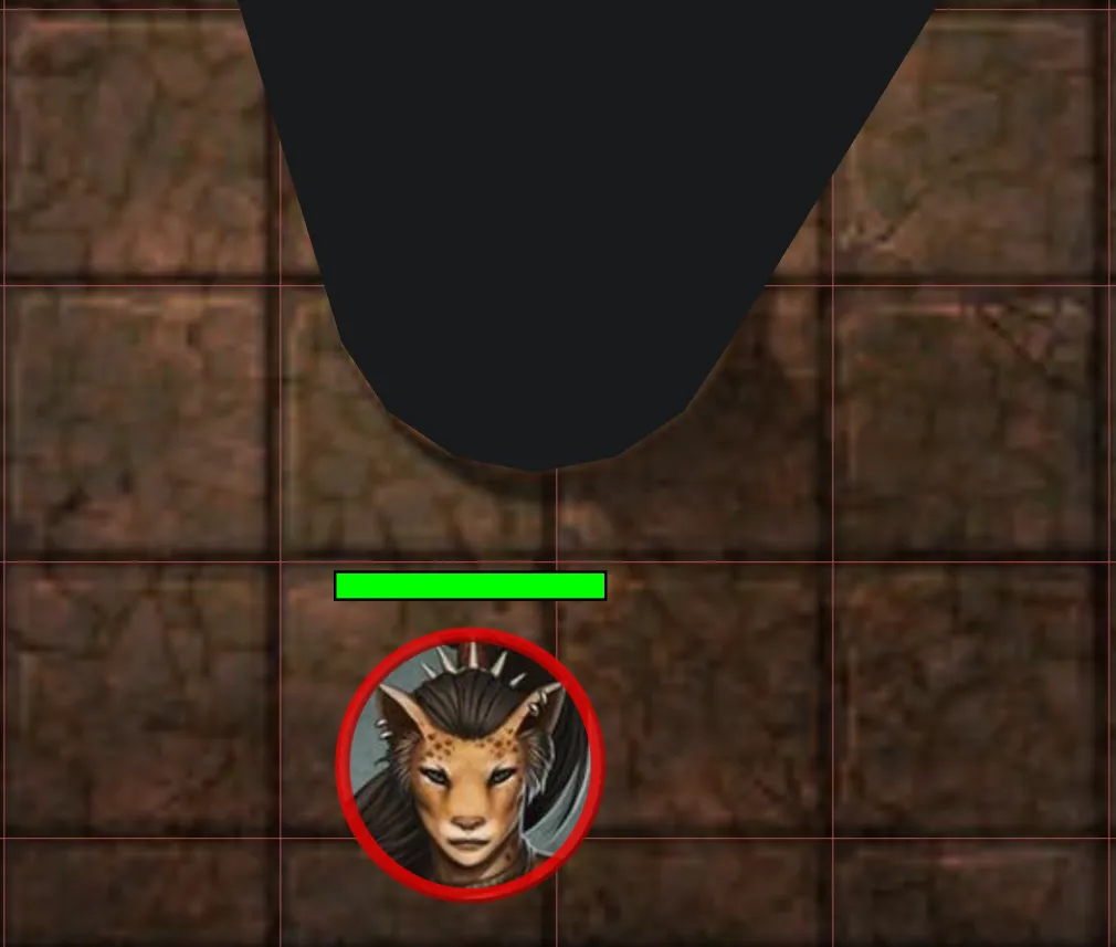
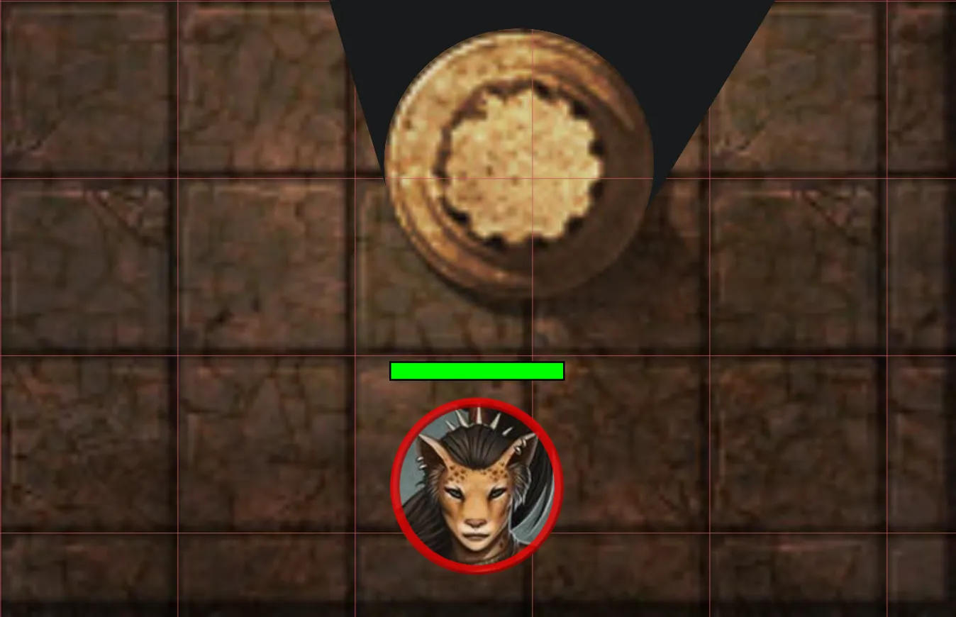
When the new mode is active, the shape marked as vision blocking will be rendered as if it’s not a vision blocking shape, but everything behind it will be fully obscured. This will for example allow you to have a tree trunk that is vision blocking, but still show the players what they are looking at (i.e. a tree trunk).
Another good usecase for this new mode is for doors. By configuring it as blocking behind, you grant proper vision to the entire door object, making it clearer to the players what they are looking at.
Complete blocking:
Behind blocking:
Limitations
This special mode only works for shapes that are closed. In practice that means it works for most regular shapes (e.g. rectangle/circle), but not for special shapes like the brush tool or text shapes.
Polygons can be either open or closed! So if you want to use this to show an irregular shape using the polygon tool, make sure that you’ve marked the polygon as closed. (this is an option in the draw tool)
Another special case is that lights placed inside objects that have this mode enabled, might render when your aura does not reach the shape. This is an edgecase of the implementation, but shouldn’t be too much of an issue in practice as there isn’t much reason to place lights inside vision blocking shapes.
Notes & Annotations
The other big change in this release is an overhaul of the notes system.
PlanarAlly has so far had 2 concepts of notes:
- loose campaign notes
- These have a title and some freeform text
- Are always private
- can be kept open / dragged around
- shape notes (known as annotations)
- These have markdown aware freeform text
- Can be public or private
- Limited to 1 per shape
- The rendered markdown is shown at the top of the screen when the related shape is hovered
A collection of problems
Both of these concepts have their own problems and are inconsistent with eachother:
- for loose notes
- there is no way to search
- there is no way to filter (e.g. only notes relevant for the current location)
- there is no way to share these with other users
- only 1 note can be open at the same time
- there is no markdown rendering at all
- for shape notes
- there is no way to have both private and public information
- there is no way to have these popped out / access them without having the shape selected
- if you need the info you wrote for a shape, you have to find the actual shape wherever it may be
- unless it’s a character, notes are lost when the shape is removed
A unified solution
To solve these problems, a unified notes system is created.
In this new system there no longer is a difference between shape notes and campaign notes. Notes are now a single concept, can be attached to shapes and managed through a new UI element called the Note Manager.

Noticeable changes
For a full overview of the new note system, check the notes documentation. This has been updated to reflect the new system and contains multiple images and a more in-depth explanation.
UI changes
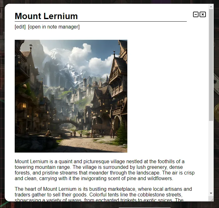
The note manager is a new UI element that can be opened by the n keybind or by clicking on the notes section in the left-side menu. It’s the core of the new note system and allows you to manage all your notes.
The note manager has a search bar that allows you to search through all your notes. Notes now also can have arbitrary tags which can be used to both search as well as give more context.
You can however also popout notes from the note manager (and some other locations) to keep them open while doing other things. Multiple of these notes can be popped out at once and they can be dragged around individually.
Additionally popout notes can also be collapsed so that they only show their title. This can be used for notes you frequently need access to in a short time span, without cluttering your screen.
Access
It’s now possible to share notes with other users and define granular access rights for them.
This means you can give view access to all players when a certain note is retrieved or give a particualr player a private note that only they can see and edit.
Player created notes are one of the few things in PA that are not visible to the DM! So these are truly private unless specifically shared.
Shapes
Notes can optionally be attached to shapes. A single note can be attached to multiple shapes and a single shape can have multiple notes attached!
This allows you to have both public and private information attached to a shape.
Additionally there is also a new note setting that allows you to configure a note icon to appear on the shape. This is useful to remember the presence of an important note. It’s now also become a setting to dictate whether the note should appear on the top of screen when a related shape is hovered. This is now by default off!
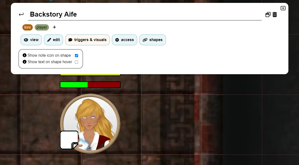
The quick info section on the right side of the screen when you have a shape selected now also has info on all notes attached to the shape. You can quickly hover over the notes to see their content, but you can also pop them out from there.
To see an overview of all notes for a particular shape you can either click on the note icon in the quick info section or use the selected shape’s context menu.
Global vs Local
When creating a new note, you choose whether it’s a global or a local note.
What this means is that a global note is campaign agnostic and will be visible in all campaigns. Whereas a local note, is related to the current campaign and even to the specific location it was made in.
Because global notes are available in each campaign, this means you should take some care to not make too many of them as usually most notes are not relevant for all campaigns.
A good use case for global notes however are stat blocks. You don’t want to redefine the stat block for a specific monster in every campaign. Combined with the use of Asset Templates you can drop a goblin on the board and have it automatically have the stat block attached.
Asset Drop Ratio
This is a new feature that at the same time also is a bugfix. It adds a new setting to the location grid setting.
PA has an option to auto scale assets when dropped if they have a specific format in their name. For example goblin_1x1 should in normal circumstances fit exactly 1 grid cell, dragon_3x3 should be resized to 3 by 3 grid cells.
The existing implementation was erroneously using a method to do this based on the 5ft system to automatically adjust this when a location had a bigger size (e.g. 10ft maps would automatically make something_2x2 fit in 1 cell)
This however completely breaks for everything that does not use the 5ft system, be it because you use SI units or because your system uses something custom or you enjoy defining your sizes in terms of pizzas.
The simple fix is to disable that system, but then dropping assets on maps that have a different scale no longer works properly. So to address that as well, a new setting: Asset Drop Ratio, is added that defines how these assets should be scaled when dropped on the map.
A drop ratio of 1 is the default, it means the asset will resize purely on it’s specified dimensions (i.e. goblin_1x1 will take up 1 grid cell even if it represents 10ft). A drop ratio of 0.5 would resize a something_2x2 to 1x1.
Dice history
Contributed by SuikaXhq
I have bigger plans to rework the dice UI and behaviour, but while I progress slowly on this, SuikaXhq has contributed a nice improvement to the existing dice history.
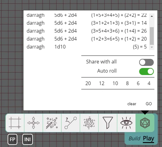
The dice history will now show who rolled the dice more prominently (it was previously only shown on hover) and contains more details on the specific roll instead of only showing the final result.
Selection Info Improvements
Contributed by SuikaXhq
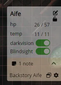
As noted earlier, the selection info section on the right side of the screen now includes information on notes attached to the selected shape.
This was not the only change to the selection info though!
Trackers and Auras show information on their current numbers and offer quick modification of these numbers. For Auras this is however not super useful, in most cases this is not something you want to change often.
This release changes the aura section to instead give a toggle to enable/disable the aura without having to open the detailed tracker settings. Additionally if the aura is limited in angle (i.e. not 360 degrees), a rotation slider is also shown, to allow you to quickly change the aura’s rotation.
Bug fixes
- Polygon edit UI: was not taking rotation of shape into account
- Teleport: shapes teleported without following would seemingly not move as the local sync was not updated
- Dice tool: Ignore the GO button if nothing is entered
- Character: a collection of bugs with variants have been fixed
- Trackers: add max-height and scrolling to fix the UI when there are many trackers
- RotationSlider: Fix synchronization issues
- RotationSlider: Fix slider anchor not sticking to the rail under certain angles
- [server] log spam of “unknown” shape when temporary shapes are moved